Introduction: The Power of Reading Crypto Charts
Welcome to the world of cryptocurrency trading, where understanding a crypto price chart isn’t just helpful — it’s essential. As a learning crypto trader and chart analyst, I’ve seen couple of newcomers jump into Bitcoin or altcoins, only to lose money because they relied on hype, rumors, or signals from so-called “experts” instead of trusting the charts.
Learning how to read crypto charts turns you from a blind follower into an informed trader. It helps you:
Grow your confidence and strategy.
Spot trends before they explode.
Avoid buying at the peak.
Protect your investments with data-driven exits.
This expert guide breaks down chart basics, popular indicators, actionable patterns, and practical tips you can use immediately. Whether your goal is day trading or long-term investing, this is your ultimate beginner-to-intermediate roadmap.
What Is a Crypto Price Chart and Why Does It Matter?
A crypto price chart visualizes an asset’s price movement over time. It’s the heartbeat of the market — a window into trader psychology. Every spike, dip, and sideways move reflects collective human emotion: greed, fear, excitement, and doubt.
Without a chart, you’re driving blind in the world’s most volatile market. With it, you gain clarity to time your trades and minimize risk.
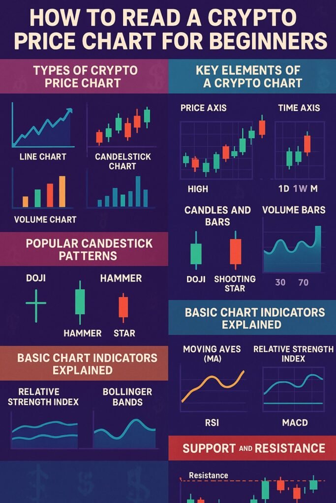
Types of Crypto Price Charts — Which One Should You Use?
Let us explore few chart types , used for different purposes
1️⃣ Line Chart: The Simple Trend Finder
The line chart connects closing prices with a simple line. It’s clean and perfect for getting a bird’s-eye view.
Use for:
- Spotting long-term trends.
- Avoiding short-term market noise.
Example:
Check Bitcoin’s 5-year line chart — you’ll instantly see the bigger trend.
2️⃣ Bar Chart: More Data, Clear Ranges
Bar charts add more detail: each bar shows the open, high, low, and close prices for a time period. It’s great for studying price ranges and volatility.
Use for:
- Identifying daily trading ranges.
- Pinpointing high and low price areas.
3️⃣ Candlestick Chart: The Pro Trader’s Weapon
The candlestick chart is the crown jewel for technical traders. Each candle reveals:
- Body: Open to close price.
- Wicks: High and low extremes.
- Color: Green for upward, red for downward.
Most traders (including me) rely on candlestick charts for real-time crypto trading because they display so much information at a glance.
4️⃣ Volume Chart: The Hidden Strength Meter
Volume charts show how much of an asset is traded during a specific period. High volume means strong trader interest — confirming whether a price move is real or fake.
Pro Tip:
Always read volume alongside price movement. A breakout with low volume is suspicious; a breakout with soaring volume is stronger.
Key Elements of Any Crypto Chart — Know Your Axes!
Let’s decode what you see on your screen:
✅ X-Axis: The horizontal timeline (1 minute, 1 hour, 1 day, etc.)
✅ Y-Axis: The vertical scale showing price levels (e.g., Bitcoin at $65,000).
✅ Candles/Bars: Each shows price movement for your chosen timeframe.
✅ Volume Bars: Usually below the price chart — the taller the bar, the higher the trading activity.
Pro traders always check the timeframe first. A trend may look bullish on the 1-hour chart but bearish on the daily chart. Context matters!
Understanding Candlestick Anatomy — The Secret Language of Price
As an expert analyst, I can’t stress this enough: learn candlesticks well, and you’ll read the market’s mind.
Each candlestick tells a mini story:
- Open price: Where the asset started during that period.
- Close price: Where it ended.
- High/Low: The highest and lowest prices it reached.
- Body: Difference between open and close.
- Wicks: Price extremes traders tested but didn’t sustain.
Essential Candlestick Patterns for Beginners
Some patterns occur repeatedly and signal possible price moves. Here are a few that every trader should memorize:
🔑 Doji
A candle with a tiny body and long wicks — shows indecision. Expect a breakout soon.
🔑 Hammer
Small body, long lower wick — indicates buyers fought back. Bullish reversal signal at the bottom of a downtrend.
🔑 Shooting Star
Small body, long upper wick — sellers rejected higher prices. Bearish reversal near the top.
🔑 Engulfing Candle
A big candle completely covers the previous one. A bullish engulfing means buyers took over strongly. A bearish engulfing means sellers dominated.
These patterns work best when confirmed by other signals like volume or indicators.
Popular Technical Indicators — Adding Extra Insight
While candles show price behavior, indicators reveal hidden momentum and trend strength. Here’s what I personally recommend for crypto trading:
✅ Moving Averages (MA)
Smooth out price data to show the overall trend direction.
- Simple Moving Average (SMA): Assigns equal importance to all price points in the calculation.
- Exponential Moving Average (EMA): Places greater emphasis on the most recent prices, making it more responsive to new data.
Example:
- If Bitcoin’s price stays above its 50-day and 200-day MA, the trend is bullish.
- If it dips below, caution — a trend change may be coming.
✅ Relative Strength Index (RSI)
RSI is the indicator to highlight if crypto is overbought or oversold..
- Above 70: Overbought — the price might decline soon.
- Below 30: Oversold — the price could rebound upward.
Use RSI to:
Confirm trend strength or spot possible reversals.
✅ Bollinger Bands
These bands are again indicators to show market volatility.
- Bands widen: Indicates high market volatility.
- Bands tighten: Indicates low market volatility.
Price hitting the upper band? Possibly overbought. Touching the lower band? Possibly oversold.
✅ MACD (Moving Average Convergence Divergence)
Tracks trend momentum.
- MACD line crosses above the signal line: Bullish signal.
- MACD line crosses below the signal line: Bearish signal.
Pro traders love MACD because it combines trend and momentum insights.
Core Concepts: Support and Resistance Explained
Support is a price level where buyers tend to step in, stopping a decline.
Resistance is where sellers take profit, halting an uptrend.
For example:
- Bitcoin repeatedly bounces at $30,000 — that’s strong support. (buy)
- If it struggles to break past $40,000 — that’s resistance. (sell)
Trading between support and resistance price levels is the smart strategy. Learning to mark these levels is foundational for chart analysis.
How to Draw Trendlines and Channels Like a Pro
Learning to draw trendlines and channels is a powerful skill in crypto technical analysis — they help you visualize the underlying market structure and anticipate where prices might reverse or break out.
What Is a Trendline?
A trendline is a straight line drawn through two or more key price points on a chart, serving as a visual guide to the market’s direction. It’s one of the simplest yet most powerful tools traders use to spot trends and plan their trades effectively.
Example Uptrend:
When Bitcoin steadily climbs from $25,000 to $40,000, you may notice it dips and bounces three times at rising lows — connect these lows for a clean upward trendline. This rising line acts as a dynamic support level — as long as the price stays above it, the uptrend is healthy.
Example Downtrend:
If Ethereum drops from $2,500 to $1,800, and each attempt to rally fails at lower peaks, connect those peaks to draw your downtrend line. This descending line serves as dynamic resistance — the price often struggles to break above it until the trend reverses.
What Are Channels?
price channel is formed when you draw two parallel trendlines that contain the asset’s price swings — one acts as support (trendline) and the other as resistance (channel line).
1️⃣ Ascending Channel:
Both lines slope upward — shows a strong bullish trend.
2️⃣ Descending Channel:
Both lines slope downward — shows a steady bearish trend.
3️⃣ Horizontal Channel (Range-bound Market):
Lines are flat — the market moves sideways, neither trending up nor down significantly.
How to Draw Channels Step-by-Step
- Identify the trend direction: Up, down, or sideways.
- Draw the main trendline: Connect at least two significant lows (uptrend) or highs (downtrend).
- Copy and paste that line: Place it parallel, on the opposite side of price action, covering the recent highs (for an uptrend) or lows (for a downtrend).
- Adjust for touchpoints: Aim to include as many touches as possible for higher reliability.
💡 Pro Tips for Drawing Effective Trendlines and Channels
✔️ More touches, more strength: A trendline or channel with 3+ touches is more reliable than one with just 2.
✔️ Don’t force it: If the line cuts through many candles without respecting highs or lows, adjust it — valid trendlines connect clear swing points.
✔️ Watch for breakouts: When price breaks out of a well-defined channel, it often signals a strong new move — traders watch this for breakout trades.
✔️ Combine with indicators: Confirm breakout signals with volume spikes or momentum indicators like RSI or MACD.
✅ Why Use Trendlines and Channels?
- Clarity: They simplify complex price movement into easy-to-see patterns.
- Plan trades: Use them to set realistic price targets and stop-loss placements.
- Spot reversals early: Breaks of key trendlines often hint at a shift in market sentiment.
Mastering trendlines and channels turns your charts from chaotic noise into structured roadmaps — a crucial skill for any serious crypto trader. Practice drawing them on real Bitcoin or altcoin charts and you’ll quickly sharpen your technical edge.
Spotting Trend Reversals — Where the Big Moves Happen
Catching reversals early can supercharge your profits. Watch for:
- Double Tops and Double Bottoms: Price hits the same high or low twice, hinting at a reversal.
- Head and Shoulders: Signals a major trend change. Very reliable!
- Divergence: Price makes a new high, but RSI doesn’t — a clue the trend may weaken.
Always confirm reversals with volume. A true reversal usually shows a surge in trading activity.
Practical Example: Analyzing a Bitcoin Price Chart
Let’s apply what you’ve learned:
1️⃣ Open TradingView and load the BTC/USDT pair.
2️⃣ Set timeframe to 1-day candles.
3️⃣ Add a 50-day EMA and 200-day EMA.
4️⃣ Add RSI and MACD.
5️⃣ Draw support at obvious price bounces (e.g., $25,000).
6️⃣ Mark resistance where price repeatedly struggles (e.g., $40,000).
7️⃣ Check if RSI is above 70 or below 30.
This multi-layered view shows you the trend, possible reversals, and strong buy/sell zones.
Common Beginner Mistakes to Avoid
✅ Don’t rely on just one signal. Use candles, indicators, and volume together.
✅ Never ignore risk management. Use stop-loss orders!
✅ Avoid revenge trading. Losing one trade doesn’t mean you must win the next.
✅ Don’t over-analyze. A clean, simple chart beats a messy one.
✅ Practice before risking real money. Try paper trading first.
Best Tools and Apps for Crypto Charting
As a pro, I use these daily:
- TradingView: For advanced analysis and sharing charts.
- CoinMarketCap & CoinGecko: Quick checks on prices and market caps.
- Binance, KuCoin, Kraken: Integrated charts for live trades.
- Crypto Screener tools: Filter coins based on volume spikes, RSI, or new highs.
Pro Tips for Next-Level Chart Mastery
- Spend 10–15 minutes daily reading charts, even if you’re not trading yet.
- Keep a trading journal. Write down what patterns you see and the outcome.
- Join trading communities. Discuss your ideas, but always trust your own analysis.
- Keep emotions in check. The chart tells you what’s happening — not your fear or greed.
Conclusion: From Newbie to Confident Trader
You now have a powerful roadmap for reading crypto price charts — the same approach used by experienced traders worldwide. Master the basics: candles, support and resistance, trendlines, and key indicators like RSI, MACD, and moving averages.
Practice daily, trust your analysis, and remember: every candle tells a story. Read it well, and you’ll ride the crypto waves like a seasoned pro.